[Moderator note: This thread was originally part of the "Clarity now only sold in California" discussion.]
I think the average car buyer wants to figure out the car by sitting in the driver's seat and taking it for a test ride.
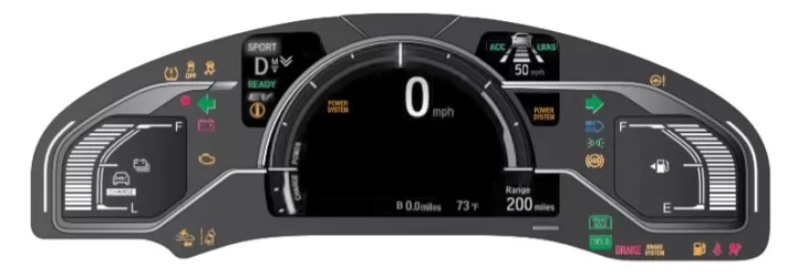
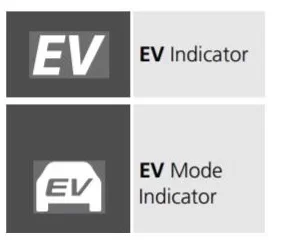
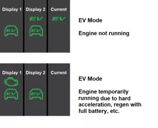
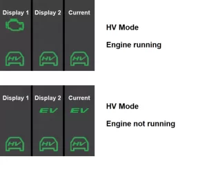
But what they see is an extremely clunky , over busy, graphic user interface. Just take a look at Owner's Guide page 33: Instrument Panel. It looks like a bulletin board filled with random PostIt notes! This is not going to give the potential customer a good feeling about the car! The graphics should be far more intuitive, eg, an icon of the car with graphics related to the indicated area relative to the car, etc.
Last edited by a moderator:
